Yoco
The easiest way to get paid
UX Writing | Content Audit | New Feature Support
ABOUT THIS PROJECT
Yoco is a South African payments platform built to support small and informal businesses. Their products make it easier for entrepreneurs to accept card payments, manage their sales, and grow without being tied to complicated systems or cash-only transactions. The brand is young, inclusive, and focused on helping small business owners thrive. I joined Yoco on a fixed-term contract to elevate the user experience through clearer and more impactful copy by:
Simplifying Product Communication: Focusing on clarity, the mission was to simplify product communication by transforming complex financial jargon into plain, everyday language.
Enhancing User Accessibility: Streamlining UX copy to ensure accessibility for those without a formal finance background, allowing for seamless operation regardless of prior expertise
Getting to Know Our Users: Spending significant time with our personas in real-life environments helped me distill a voice that resonated in a way that felt true and authentic to the user.
THE CHALLENGE
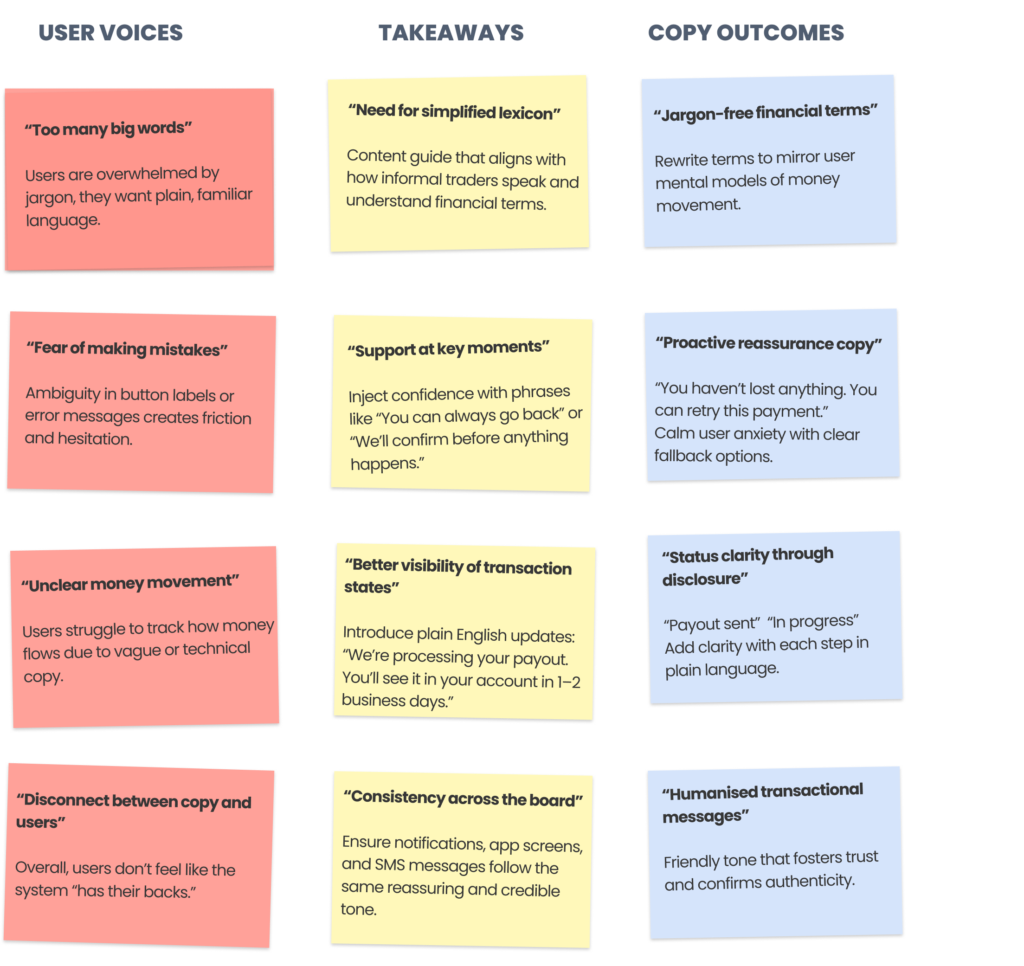
Yoco entrepreneurs expect more than a payment terminal; they demand smart simplicity, transparent pricing, and tools that work as hard as they do. For many of these business owners, every transaction represents a hard-earned milestone, yet the industry has long buried the excitement of a sale under the weight of “bank-speak” and opaque processes. This disconnect creates a mental tax, forcing merchants to navigate a maze of technicalities when they should be focusing on their passion. To bridge this gap and build lasting trust, we transformed our communication strategy through five key pillars:
Bridging the Empathy Gap: We moved beyond the screen to shadow merchants in their high-pressure environments, from bustling coffee shops to open-air markets. By observing the chaotic reality of a busy checkout, we identified exactly where technical language creates friction, allowing us to design copy that survives the “real world” test.
Humanising Financial Services: Leveraging our field insights, we developed an approachable, jargon-free voice that simplifies complex banking processes. We moved away from intimidating industry terms to create a more supportive and empowering atmosphere that mirrors the informal, yet professional, way traders actually speak.
Optimising Transactional Clarity: We streamlined the messaging around payments and payouts to mirror helpful, peer-to-peer conversation. By replacing robotic prompts with clear, actionable guidance, we build immediate trust during the sales process, ensuring the merchant feels in control of their cash flow.
- Standardizing the Narrative Ecosystem: To ensure a seamless experience as a merchant scales, we institutionalized these insights into a unified content guide. This ensures that whether a user is checking their dashboard or tapping a card, the language remains consistent, predictable, and reliably simple.
- Proactive Support Integration: We refined error messaging and help triggers to offer calm, solution-oriented language that reduces anxiety during critical business moments. By anticipating the merchant’s “moment of doubt,” we provide the right information at the right time to prevent technical interruptions from becoming business hurdles.
USER COPY
GUIDING THE JOURNEY
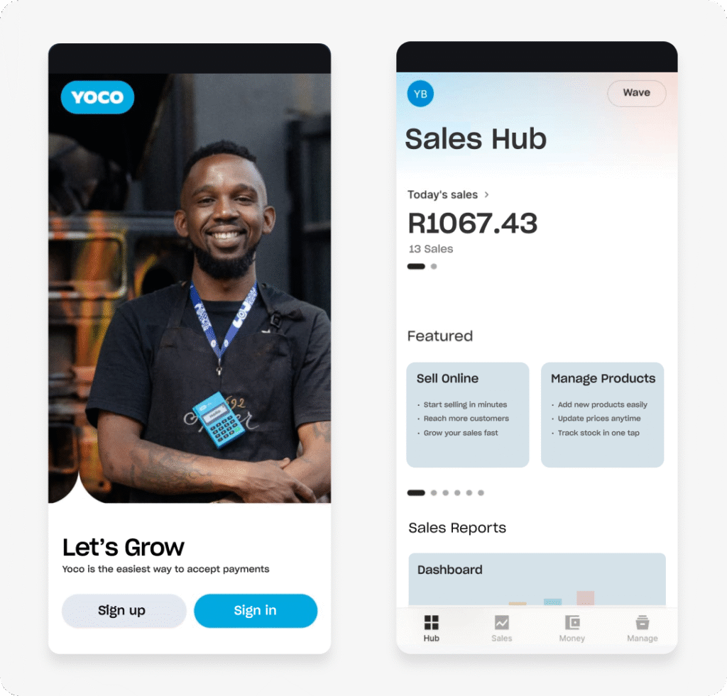
The onboarding sequence introduces the “Let’s Grow” mantra to shift the focus from a cold transaction to a shared ambition, utilising intuitive “Sign up” and “Sign in” entry points. This ensures the first touchpoint feels less like a technical setup and more like the start of a professional partnership.
Stripping away the complexity of traditional finance, the tone centres on merchant-first empowerment to build immediate confidence in the digital toolset. I prioritised active, momentum-based phrasing that aligns with the fast-paced reality of running a business.
SIMPLIFYING CHOICES
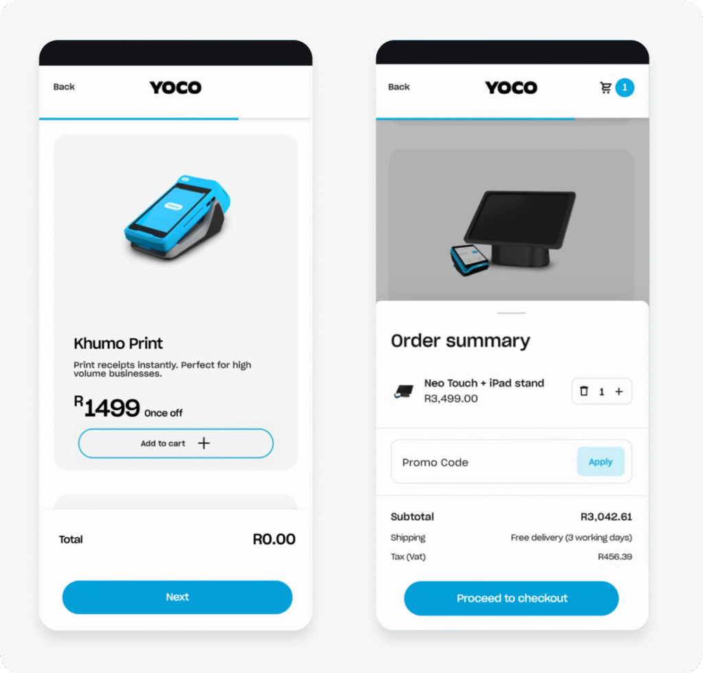
The product selection screens employ clear imagery to assist business owners in identifying the ideal hardware for their specific requirements. Direct, action-oriented labels establish a straightforward path to purchase, creating a transition from browsing to buying that feels completely intuitive.
By grounding the interface in merchant-first empowerment, the voice bridges the gap between sophisticated payment technology and a familiar service. In these screens, I utilised minimal copy to allow users to navigate the purchase journey without uneeded clutter.
STREAMLINING REGISTRATION
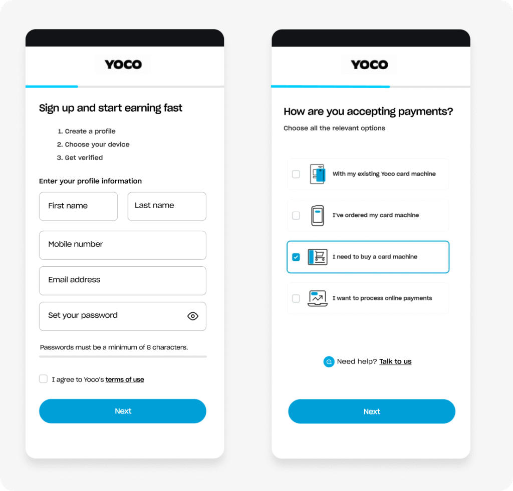
Plain-language questions and straightforward input labels navigate users through the flow efficiently, eliminating the common friction associated with technical terminology. This direction prioritises clarity and ease of use, fostering a digital environment where entrepreneurs feel empowered rather than overwhelmed.
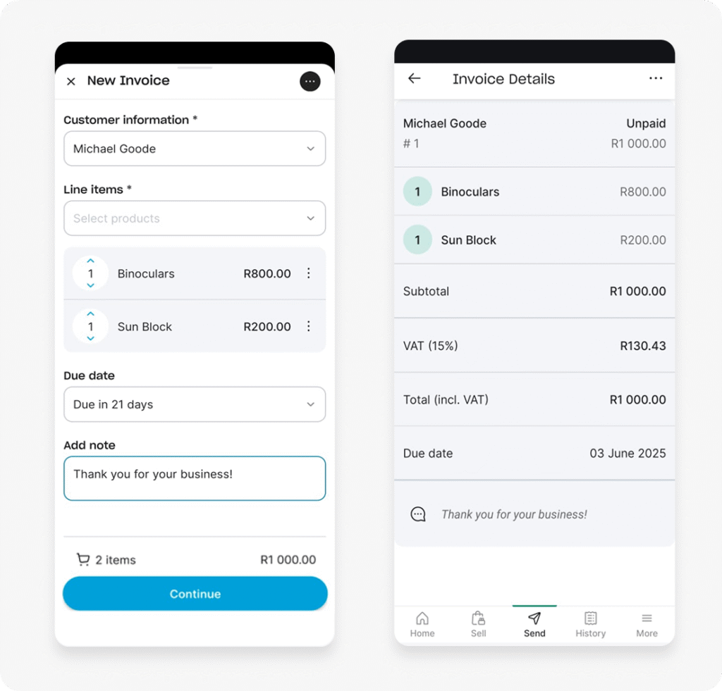
REDEFINING INVOICING
A clean information hierarchy paired with logical input fields converts the complex task of invoice creation into a series of intuitive, manageable steps. By prioritising high-visibility data and straightforward labels, the design enables users to finalise their billing quickly without the friction of navigating dense administrative layouts.
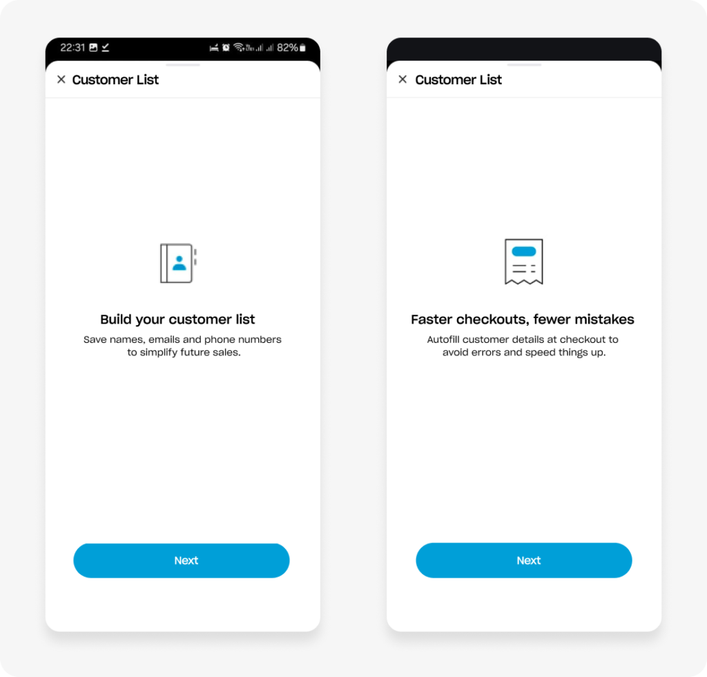
REDUCING COGNITIVE LOAD
By stripping away non-essential UI elements and focusing on a singular, high-impact message, these educational screens serve to orient the user without causing information fatigue. The copy is deliberately minimal to ensure the primary benefit is understood at a glance, allowing the merchant to proceed to the next step of the flow with total clarity.
Replacing technical explanations with outcome-based language shifts the focus from how the tool works to what it actually achieves for the business. This directness eliminates the need for interpretation, transforming a potential point of friction into a seamless moment of discovery.